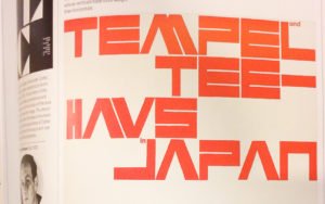
For the last 5-6 years I’ve been avidly (compulsively) collecting the odd typographic phenomenon of the bar-less Latin capital letter A (like this: Λ). For some reason, many many designers feel comfortable chopping off the horizontal crossbar; they think it transforms the typeface into anything from rustic and runic, to techy and space-aged.
Warning: Once you start noticing barless A’s, you will see them everywhere.
Kinda like this:

My image collection is growing daily (I see/photograph on average 1 new example per day!), and I’ve been meaning to post everything somewhere for years… I’ve just never gotten around to it (and it becomes more difficult to start with every new image I find). But the time has come for a preview of what’s in store. The pictures below are a tiny sampling of the range found in the collection.
Later this year I’ll finally get all my images uploaded, tagged, and sorted for browsing and reference over at The Barless A.
Coming ΛSΛP!
PS– Thanks to Florian Hardwig for the ongoing motivation to actually getting this going!


