Skip to content

You Should Like Type Too

Main navigation
  • Blog
    • Cemeteries
    • Conferences
      • ATypI
      • ICTVC
      • Kerning
      • Robothon
      • TypeCon
      • Typo Berlin
      • Others
    • Exhibitions
    • House Numbers
    • Instagram
    • News
    • Nice Signs
    • Mini Posts (Not just type)
    • Miscellaneous Things
    • Packaging
    • Typography & Lettering
  • Typefaces
  • Art
  • Places
    • England
      • Brighton
      • Ditchling
      • London
      • Sonning
    • France
      • Antibes
      • Nice
      • Paris
    • Germany
      • Berlin
      • Frankfurt
      • Leipzig
    • Greece
      • Athens
      • Mykonos
      • Patras
      • Thessaloniki
    • India
      • Ahmedabad
      • Delhi
      • Goa
      • Kolkata
      • Lucknow
      • Mumbai
    • Italy
      • Faenza
      • Florence
      • Genoa
      • Naples
      • Pisa
      • Rome
      • Torino
      • Venice
    • USA
      • Boston, MA
      • Buffalo, NY
      • Champaign, IL
      • Hoopeston, IL
      • Memphis, TN
      • Milwaukee, WI
      • Nashville, TN
      • New Orleans, LA
      • New York City, NY
      • Reno, NV
      • San Francisco, CA
      • Two Rivers, WI
      • Washington DC
    • Other
      • Amsterdam, The Netherlands
      • Barcelona, Spain
      • Brno, Czech Republic
      • Budapest, Hungary
      • Den Haag, The Netherlands
      • Jerusalem, Israel
      • Kusadasi, Turkey
      • Lisbon, Portugal
      • Nicosia, Cyprus
      • Prague, Czech Republic
      • Reykjavik, Iceland
      • Tel Aviv, Israel
      • Warsaw, Poland
  • About
  • Archive
9 March, 2018

A Successful Logo

I don’t do much graphic design anymore, basically just collateral for Mota Italic. But on the occasion of the 12th Mumbai Typostammtisch, I had the pleasure to create a logo and bit of branding for the evening. And this must be my most successful piece so far, because it received the more online trolling than anything else I’ve ever done (it makes me think of that quote about how if you aren’t pissing people off you are being interesting…). Many people wrote to us wherever we posted these logos to point out our stupidity. To be fair, they didn’t seem unhappy with the design but with the transliteration… In any case, this was my favorite exchange on Instagram that illustrates the issue:

Mikhail Mehrotra
I am sorry but aren’t you a typography firm that also does Indic fonts?? How can you then Transliterate Typonight as “टुपोनाईट”??? Shouldn’t it be “टायपोनाईट”???? Typo in a Typography firm’s post. What an irony!

Mota Italic
Hi @mikhailmehrotra! This spelling is intentional – it’s derived from the German pronunciation (Tupo), as is the group’s name: Typostammtisch / टुपोस्टाम्मटिश / too-poe-shtaam-tish.

Mikhail Mehrotra
But that’s clearly a lost cause, because it is not clear from the artwork/ creative. If the people that follow you, already know about it, then it’s okay. Anyway, Thanks!

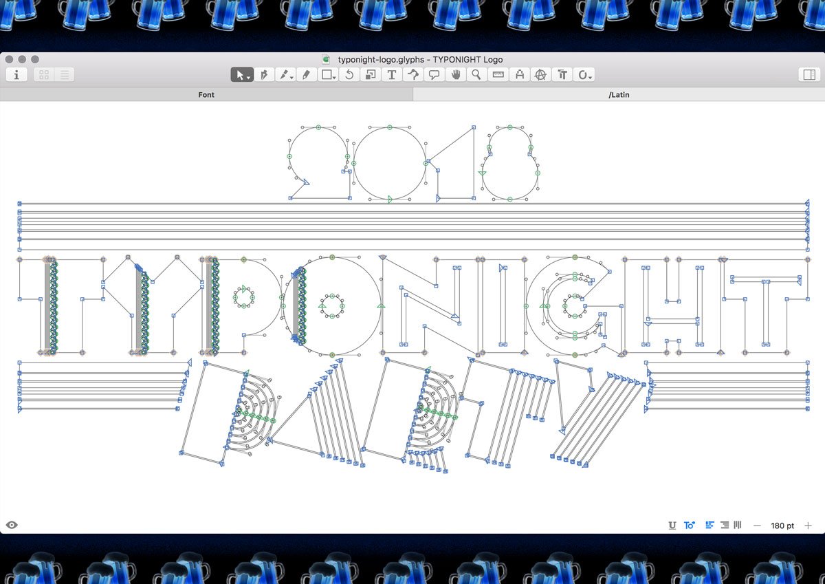
The logos were made in Glyphs and exported as a font. Here you can see the whole thing combined (as it was drawn), but then I also separated each component into their own glyphs so they can be easily colored and layered individually.

It even had a little animation!

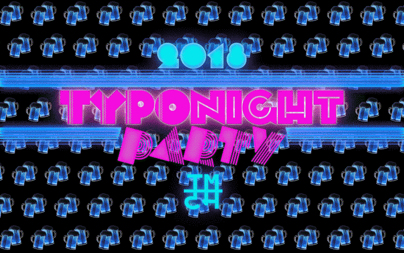
Higher resolution version here (9.4mb)

Oh also, the party was fun!

Posted in: Miscellaneous Things, Mumbai, Typography & Lettering
Tagged: Bilingual, Devanagari, logo, mumbai, Typostammtisch

Share this post via:

  • Facebook
  • Twitter
  • Pinterest
  • Reddit
  • LinkedIn
  • Email

A Few Related Posts:

The Recent Posts:

  • Show Me the Mono Day in Typodarium!
  • Italic W
  • Foamy R
  • The Current State of German Fireworks Packaging
  • TypeHunting.com

Back on this day in:

  • 2018: Blurry truck lettering of the day

One Random Post:

  • Midnight train

    Midnight train

Latest Tweets:

  • Dear Twitter friends & followers, Do any of you absolutely love your web host? I’m currently considering moving som… https://t.co/Sla31x5uI0 March 15, 2023
  • Showed my parents Super Troopers and they really hated it (similar to how @arialcrime & @ingaploennigs reacted to Christmas Vacation). December 23, 2022
  • @PhilippNeumeyer Hahahahahaha! Also: 😭😭😭 December 01, 2022 in reply to PhilippNeumeyer
  • I should also clean off my desktop. This screenshot is actually from today. And FYI, I did finally turn off Time Ma… https://t.co/BRnEst4ED5 November 30, 2022

Connect:

Twitter  |  Facebook  |  Contact

Support independent type design & visit
Mota Italic

  • Home
  • Archive
  • Home
  • Privacy Policy
  • Typefaces
    • Specimens & Samples
    • Vesper
      • Vesper Preview 1
      • Vesper Preview 2
  • X-Berg flat 2013-14
  • ART
  • About
    • My Year at Reading
This site uses cookies to improve your experience like every other website in the world. Accept Reject Read More
Privacy & Cookies Policy

Privacy Overview

This website uses cookies to improve your experience while you navigate through the website. Out of these cookies, the cookies that are categorized as necessary are stored on your browser as they are essential for the working of basic functionalities of the website. We also use third-party cookies that help us analyze and understand how you use this website. These cookies will be stored in your browser only with your consent. You also have the option to opt-out of these cookies. But opting out of some of these cookies may have an effect on your browsing experience.
Necessary
Always Enabled
Necessary cookies are absolutely essential for the website to function properly. This category only includes cookies that ensures basic functionalities and security features of the website. These cookies do not store any personal information.
Non-necessary
Any cookies that may not be particularly necessary for the website to function and is used specifically to collect user personal data via analytics, ads, other embedded contents are termed as non-necessary cookies. It is mandatory to procure user consent prior to running these cookies on your website.
SAVE & ACCEPT