The newest type craze:
The hot new trend in typography is not embedding – no, it’s not @font-face or even Typekit. It is printed neither offset nor digitally. Best of all, it is possibly the greenest form of design! Forget about the silly, over-hyped Eco Font, this typography needs no paper or toner whatsoever; it doesn’t even use fonts. It only requires a pen (or some paint) and a volunteer! This hot typographic trend simply uses the human body as the canvas. Not exactly a new concept, but some recent developments are still worth sharing (i.e. not innovative, but nice to look at).
A brief history:
Tattoos have been around for thousands of years and they are now a relatively mainstream form of expression. Typography is quite commonly, at least for the most interesting ones, a significant element of tattoos. Less permanently than this bodily decoration, at some point everyone has utilized their hand or arm as a makeshift notepad for a phone number or quick idea (at least b.c.p. (before cell phones)). Stephan Sagmeister gained international fame when he scratched a whole poster’s worth of info into himself (then he used a photograph of his mutilated skin for the actual poster). Skin has been used as a canvas forever. Classic illuminated manuscripts were written on skin (vellum most commonly made from calf, sheep, goat, or deer skin). Now-a-days you can visit almost any major sporting event (especially football (soccer) or football (football)) and find a group of fans spelling things out with large painted letters on their chests. One final specimen, last year we saw the indirectly related “fake-body-typography” implemented on the latest James Bond book covers. Those illustrations follow the same concept, but are a fundamentally different execution. Aside from these few instances, there are countless other great type-on-the-body examples.
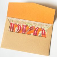
“Hot” trend case study #1:
Recently at TYPO Berlin, Mrs. Eaves / Gemma O’Brien (whatever she prefers to be called) (from the blog for the love of type) engaged in a rousing performance piece where she used herself as a typographic canvas. She covered a fair amount of her epidermis with conference related words (mainly TYPO, Berlin, Spaces, & 2009).

image via for the love of type

image via for the love of type

image via for the love of type
She did something similar earlier as part of a campaign to promote designated graffiti spaces as opposed to vandalizing other’s property. This nice idea was documented it in a video:
“Hot” trend case study #2:
For more hot typography -hot off the presses- Esquire magazine has applied a similar concept to their current cover. Attentive viewers will notice a model (Bar Refaeli) with some of the contents scrawled on her. Look carefully though, as to not her or that great lettering. The cover is dominated by some beautiful grey text (Mercury by Hoefler and Frere-Jones) that jumps out – loudly.

Photograph by James White via Esquire Magazine
One can more easily appreciate the fine hand lettering in the photos from the inside pages – which aren’t surrounded by other sensuously-distracting fonts.

Photograph by James White via Esquire Magazine

Photograph by James White via Esquire Magazine
Stephen King has never looked better thanks to the lettering of James Victore. More great work at his site.


