From October 2006-2007 I attended the MA Typeface design program at the University of Reading, UK. Throughout the year I posted news and images here pertaining to the RDG experience. This page is a collection of those updates – hopefully it sheds some light on the program and what the year is like.
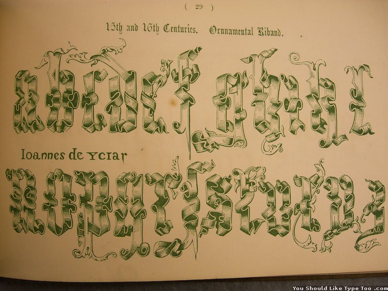
4 Oct 2006 – Introduction


A map showing where we all came from, truly an interesting mix. Next, welcome to Spur H… Let’s pass around this manuscript page from 1200-something. You there: grab this Palatino’s notebook from the 1500s.
Exhibit in the hallway


Some nice photos of decorated Indian rickshaws.
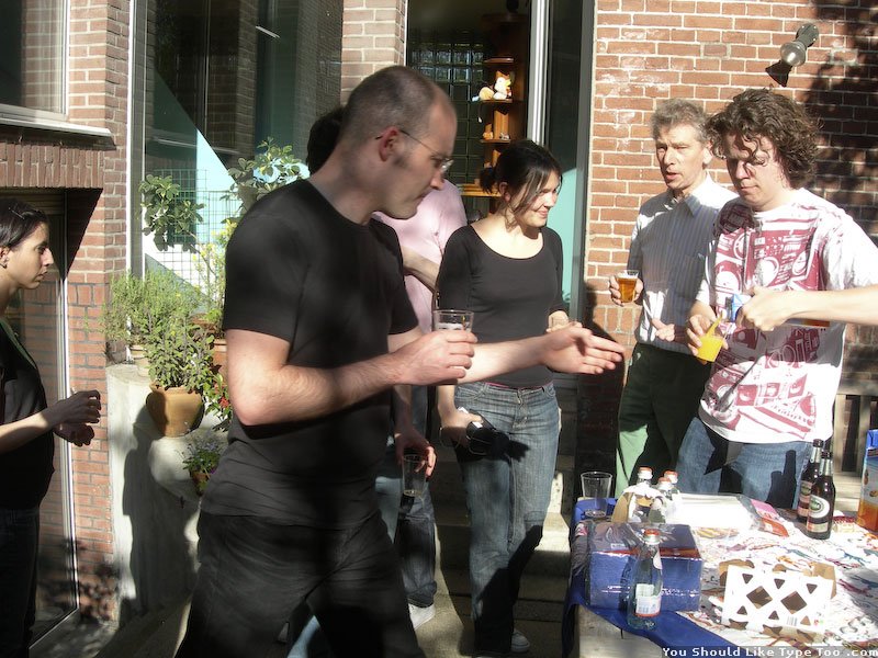
14 Oct – The First Party at Oaklands


A fun evening to get to know each other a bit.
19 Oct – Dinner with T. Phinney, G. Unger, and More


Party of nineteen hungry type geeks at a Nepalese restaurant with painfully slow service. Thanks to Tom Phinney and Adobe for generously inviting us all!
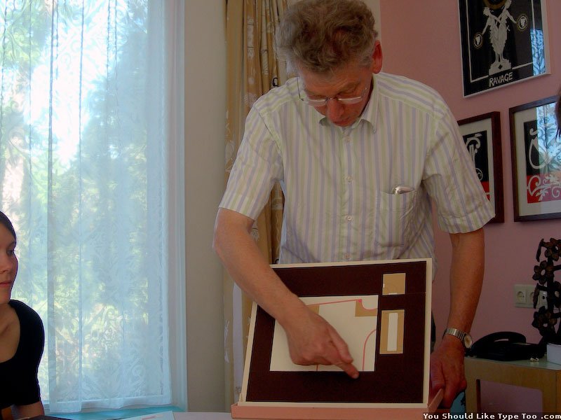
A few classes


(From L to R) Gerard Unger critiquing some of our first sketches. A slide from James Mosley’s interesting lectures. Gerry mapping out what our year will look like.
Dr Michael Twyman and his amazing collections
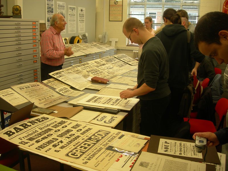


Michael Twyman started the typography department here, and luckily, is still giving his famous presentations. These are all posters from Britain from the last few hundred years out of Michael’s personal collection. Most were mid 19th century carted all the way to the school and laid out for us to see, touch, and smell. The first three sessions so far have been like this. However, this showing was so substantial, there was an overflow into an adjacent room.
Visit to St. Brides in London


We got a behind the scenes tour of the library and lecture about how to make type.
Another Twyman Session


Amazing collections of (mostly French) lettering samples.
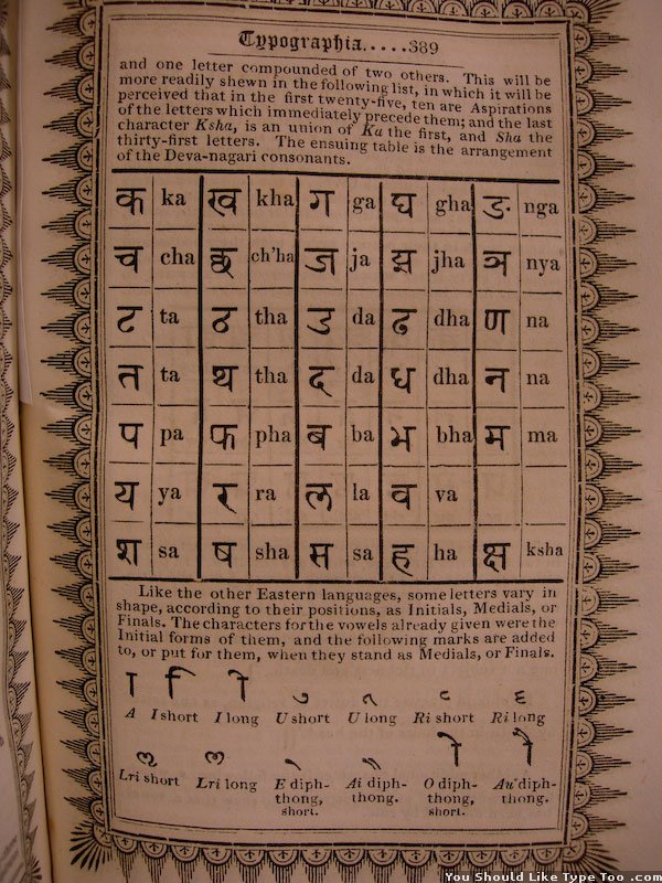
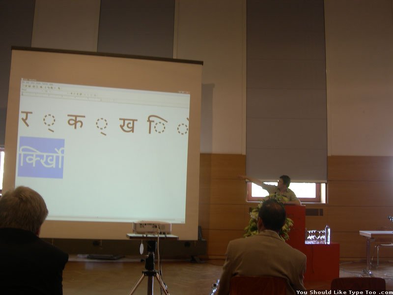
Fiona Ross’ First Non-Latin Workshop – North Indic


The self proclaimed “bag lady” carted an immense collection of printed materials featuring Northern Indian scripts. We received several great lectures surveying the history of Indic type design as well as general approaches to working with non-Latin scripts. It was thoroughly intimating, but encouraging at the same time.
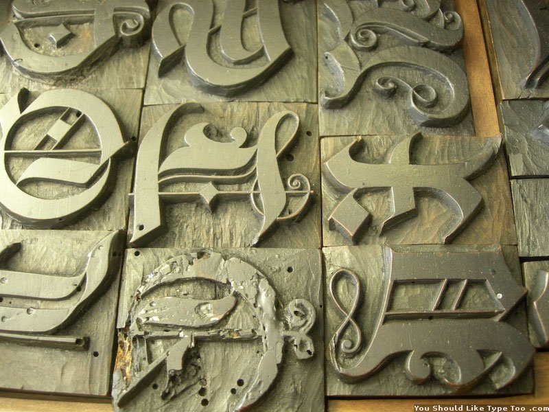
17 Nov – Spur H 3D Letter Samples


Spur H is packed with interesting objects. This week as part of an undergraduate project, they had examples of 3D type spread out throughout the wing.
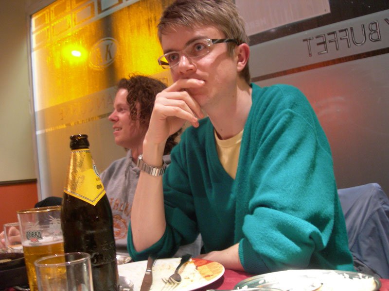
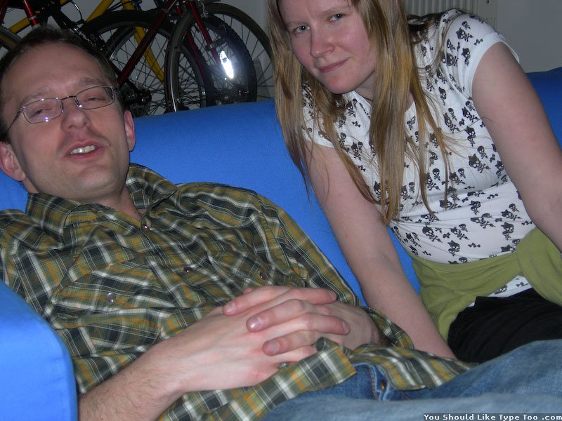
18 Nov – Just at a Pub

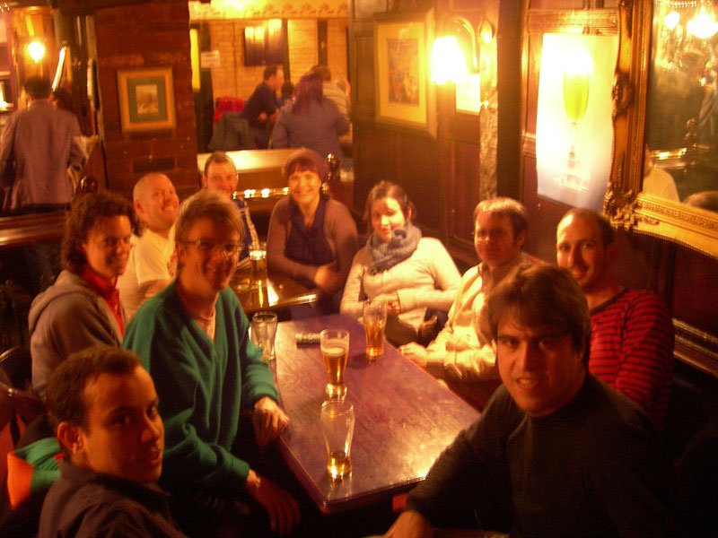

Commemorating a weekend evening out. From left to right: Ian, everyone, Cormac & Jenni.
22 Nov – Visiting Nepali Demo


These are a couple aspiring Nepalese type designers here for two weeks. Fiona and Jo are intensely working with them to create a Devanagari typeface (almost from scratch) while they are here. During a short break, they offered us a calligraphy demo and spoke a bit about sign painting.
Greek Week


Gerry being the internationally recognized expert of Greek type design, is also a fanatical collector of Greek type history. In most cases these are rare, priceless, un-replacable pieces of history that, luckily for our education, he is happy to share with the class. Quote of the week: “The Greek script is like a roller-coaster for your hand.” — Dan R.
1 Dec – Martin Andrews Lecture


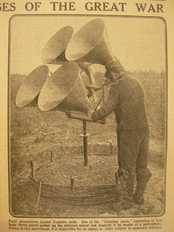
During a talk about the history of newspapers Martin passed around some old magazines. The first two are just amusing ads and the third is a wonderful invention from “The War Illustrated.”
Twyman’s Directories


This week’s theme was “directories.” Michael shared a huge range of every shape, size, and variety of directory from the last few hundred years. These here are the more impressive examples, if only for their size. These are the last of their kind; due to the ever increasing page counts, they later started producing different volumes for more specific locations or functions. (Notice the advertising on the edges… It is surprising more books don’t use that space like these do)
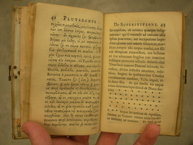
December and January


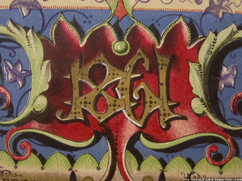
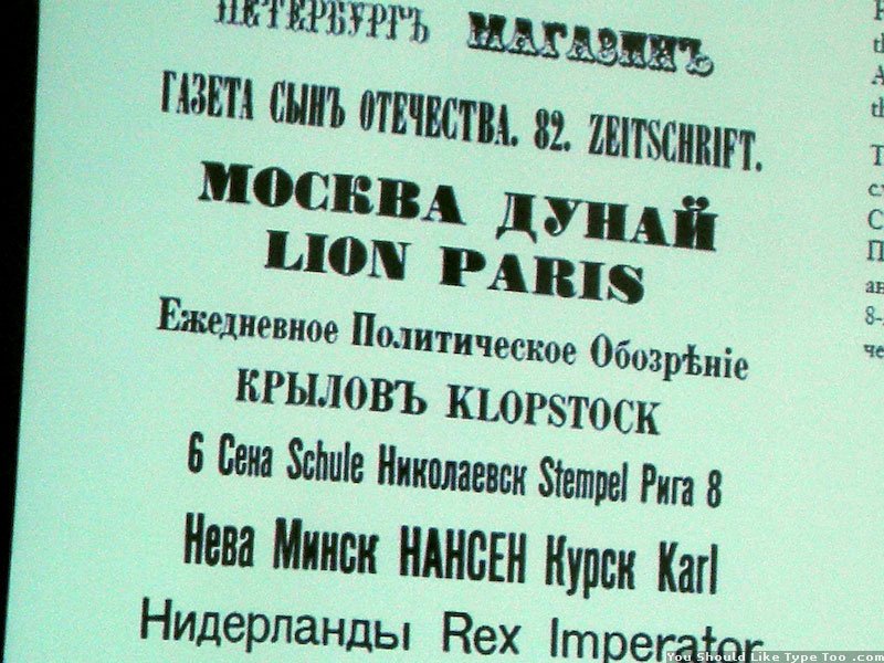
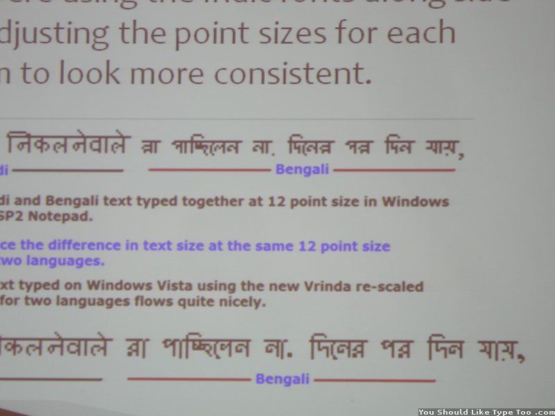
Classes were off from mid Dec through mid Jan. The weather was cold and rainy, and it was getting dark around 3:00 – 3:30. Our essay was due a week after classes began again in January, so much of the break was spent researching. The first image is of my room showing a partial sample of the essay resources. That is maybe about a third of everything I needed to go through to write about the development of Matthew Carter’s Devanagari typeface for the Linotype V-I-P phototypesetter. The second image is from the pub called The Retreat. They have a jazz band there every month, and they were great. The photo just about captures the entire room; yes it was tight. The last is just of a slide from one of James Mosley’s lectures at the end of January- rather amazing £. It was great to get back to classes and lectures, and to finally finish the essays.
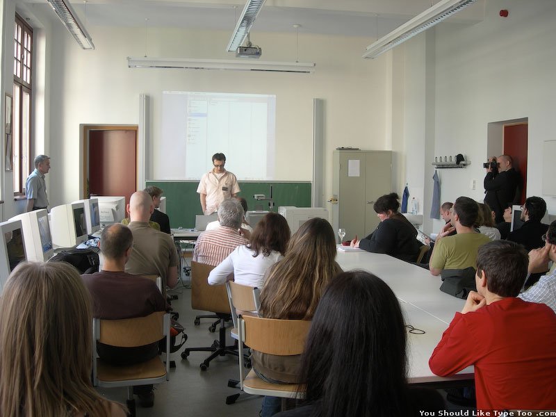
More January Lectures


Michael Twyman showing a very old passport. Gerard Unger talking about some type that isn’t French or Dutch. Adam Twardoch giving us a day of FontLab Q and A.
Reading Weather


While many of the trees are bare, it is still very green all around Reading. The grass is perfect and green moss is everywhere. Surprisingly, there are even flowering plants in every yard as well. The first image was taken on a January morning. The frost on the grass detracts from its normal vibrance a bit. The second was taken right down the road after an incredible storm in January. The final images proves that it does actually snow in Reading. This was the third or so snowfall (on Feb 8th), and was absolutely the most we have seen. Usually there are just a few flurries, but not much sticks. Unfortunately, most of it was melted by the end of the day.
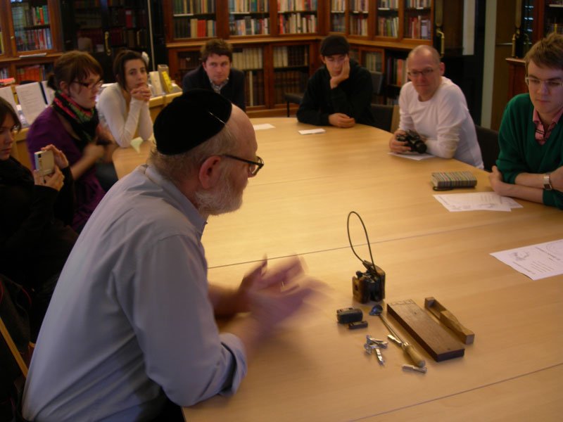
Eric Kindel’s Stencils


Eric Kindel gave us a seminar about his research regarding stenciling. He presented a similar talk at ATypI in Lisbon, but this time there was new material and actual samples of things to look at and touch. The stenciled samples are not the greatest, but they do illustrate the concept and show how some of these books were made.
15 Feb – Marjan Unger Show & Tell


During this week that Gerard was with us again, he brought along his wife. She turned out to be a very impressive woman who really knows her design. She and Gerard make an interesting couple being very different, yet very similar at the same time. She shared with us her extensive background in design, editing, fashion, and art– with a bit of Dutch culture mixed in. The third image is from the funniest Dutch magazine “De Poezenkrant”. It is a self published magazine released whenever the guy gets enough content, but it all has to do with cats. Very funny stuff. Kudos to the Underware guys too for sending in Fakir to be used for the titling (there was a letter to the editor type message from Underware to the cat magazine).
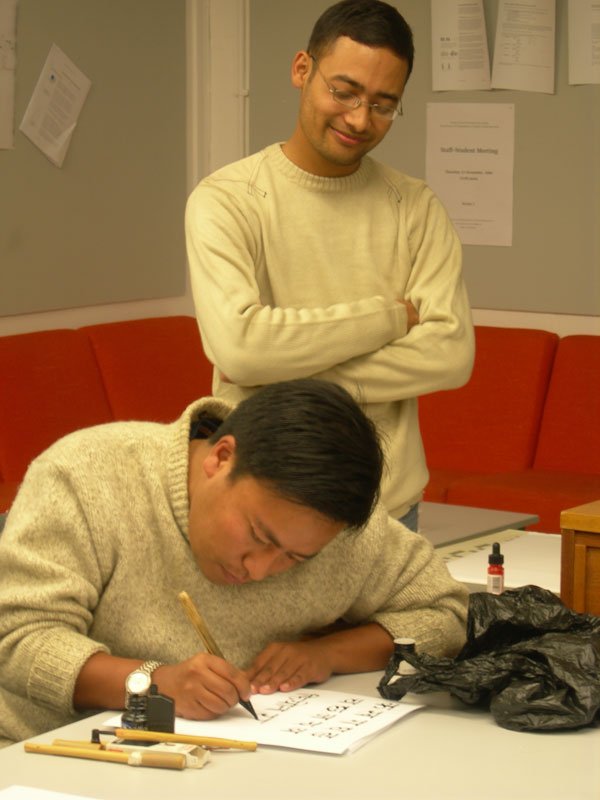
21 Feb – František Štorm’s Visit


František happened to be in Reading for the day (maybe to see us, maybe to consult with Gerry on a Greek type design project). He had many interesting images of his students work from Prague and many specimens of his own designs to pass around. All in all, it was a very nice visit.
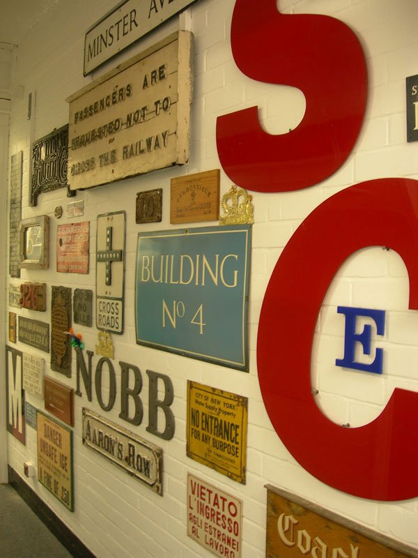
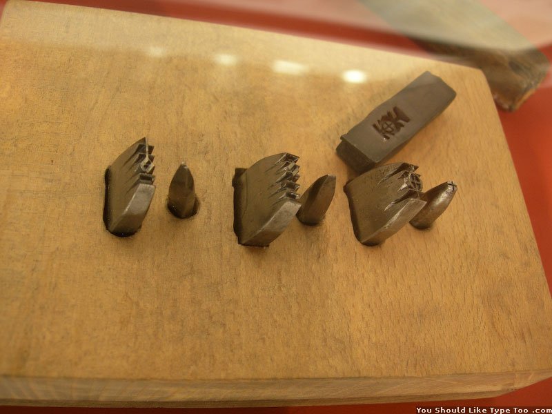
More Random Spur H Ephemera


As you know by now, the department has an incredible ephemera collection. Submitted for your viewing pleasure are a few more samples from these collections, all with a local flavour.
London Signs


There is nothing extraordinary about any of these, they were simply some new ones that caught my eye.
24 Feb – House Ind’s Rich Roat in England!


Rich generously agreed to visit us in Reading after the One Friday conference in London. He spent the morning sharing stories about how House Industries got started and the way they go about working. Note to self/others: Don’t follow House’s business plan. It seems to be working out for them a bit of the time though. The first snapshot captures Rich’s reaction to the gourmet English pub food (hot out of the microwave). Shortly after, he was back to London to give a presentation at the Apple Store. During the talk he wouldn’t stand still long enough to get a decent portrait… Don’t ask about the last image. Check out their site for more.
26 Feb – Twyman Non-Latin Lecture


Here are a variety from Michael’s personal non-Latin collection. This sampling was probably the most diverse and incoherent of all his lectures, but it was still a good overview and worthwhile – especially for those not exposed to these scripts otherwise.
27 Feb – James Mosley


Just a few from one of his talks.
03 Mar – Another Oaklands Party


Another nice evening with friends. Oddly, all four Finnish people in England were in attendance.
12 Mar – Chromolithograph


Another Michael Twyman lecture with a hundred awesome samples.
13 Mar – Victor Gaultney


Victor is visiting Reading four times this year to lecture and give critiques. This time the talk is on Cyrillic; its history and design considerations.
14 Mar – few old newspapers from Spur H

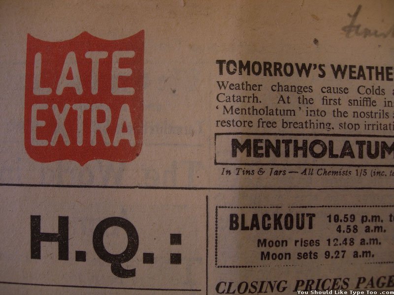

These images are just from a few papers Jasso was researching. They are from during WWII and are interesting both in their design and also in the stories they tell & how they report the news (see the first image in particular)
19 Mar – Monograms


What are they, what are they used for, where did they come from?
21-28 Mar – Italy Trip


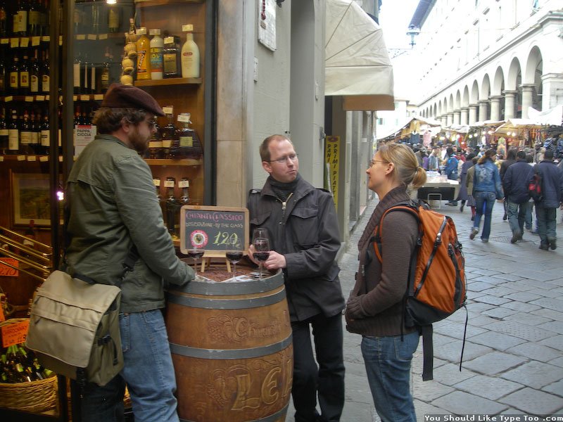
Well the Italy trip was amazing. Cheers to Charlene, Martin, Eric, and Mick for organizing the perfect excursion. From the top left to bottom right: 1.) the group listening to Martin describe an inscription, 2.) the typical scene at every piece of lettering in the city, 3.) Leo and Constantine, 4.) the forum, 5.) Jasso and Trajan’s infamous column, 6.) Myra looking over the city, 7.) The Baker’s Tomb just outside the city walls 8.) Inscription in Santa Croce that looks familiar from somewhere… 9.) 80 cent wine x 12 glasses on the last day.
27-29 Apr – TypoTechnica
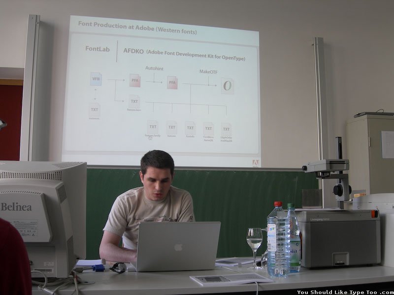


Hosted in Frankfurt, Linotype’s 2007 TypoTechnica conference turned out to be a very good weekend. As usual, there was a range of talks from the general/obvious to very technical and maybe unpractical for the average designer. Overall though, it was helpful to see and hear about the new developments with OpenType, software, and operating systems in regards to how fonts should be produced and how they are utilized.
[Update] I was offered a job at Linotype during the conference!
1-3 May – NL/BE Trip


This was a quick, unofficial class trip to the Netherlands and Belgium. The first day we went to the Enschedé museum in Haarlem then later to Gerard Unger’s house for dinner and some show & tell (pics 1-3). Next was The Hague to see the Museum Meermanno (pic 4) and stamps at the Museum of Communication then to Thomas Milo’s house for another dinner and to see his work with Arabic. Then finally we went to Antwerp, Belgium to visit the Plantin-Moretus Museum (pics 5-8). Altogether it was a great experience because at each location we went ‘behind the scenes’ and had wonderful custom tours and explanations as well as access to many original materials: Garamond punches, Van Krimpen drawings, various sketches for stamps, really old books…
Random Beasts and Type from Reading


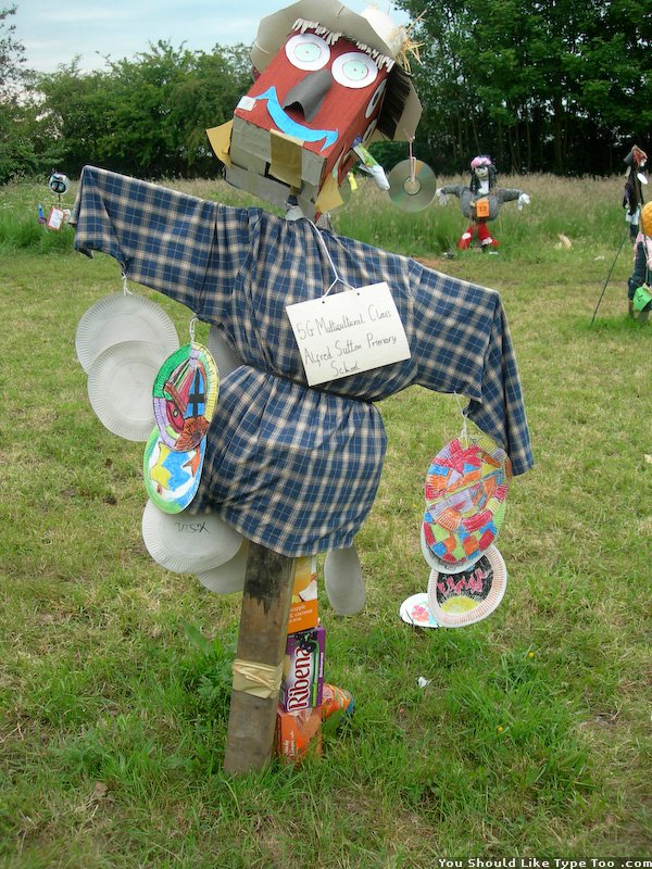
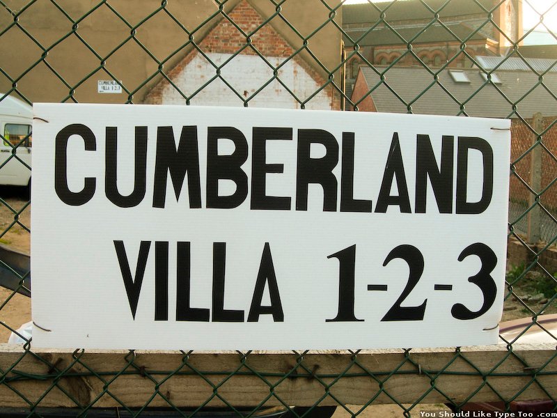


These swans are all over the canal in the city centre. They live very happily off old bread. Sonic lives near us, but he isn’t very fast and didn’t appear to have any gold rings. There was a field of junk scarecrows made by primary school students. I don’t know anything about the project, but they were all very interesting. As for the unfortunate signs… I actually like the Cumberland Villa sign quite a bit. The Devanagari tattoo is sad use of Mangal (the default Devanagari typeface on Windows). It has problems with conjuncts and vowel placement, but actually looks better on the screen than on her. Evidently neither she nor the tattoo artist knew what the text should look like. What is this Gents sign saying? Is the loo for single or double amputees?
19-24 Jun – ICTVC iconference in Thessaloniki


The 3rd ICTVC conference went pretty well and was a great week — besides the insane heat. The first image is one of my favourite slides from any talk. It is from José Scaglione and Andreu Balius showing an improvised tilde using two commas. The other images: dinner the last night, a sign, Dan Reynolds saying either “Rock on” or “I said don’t take my photo!”, Neville Brody talking about his Mercury copy, and Dan Carr giving a punchcutting demo.
Jul – Signs from Southall & London

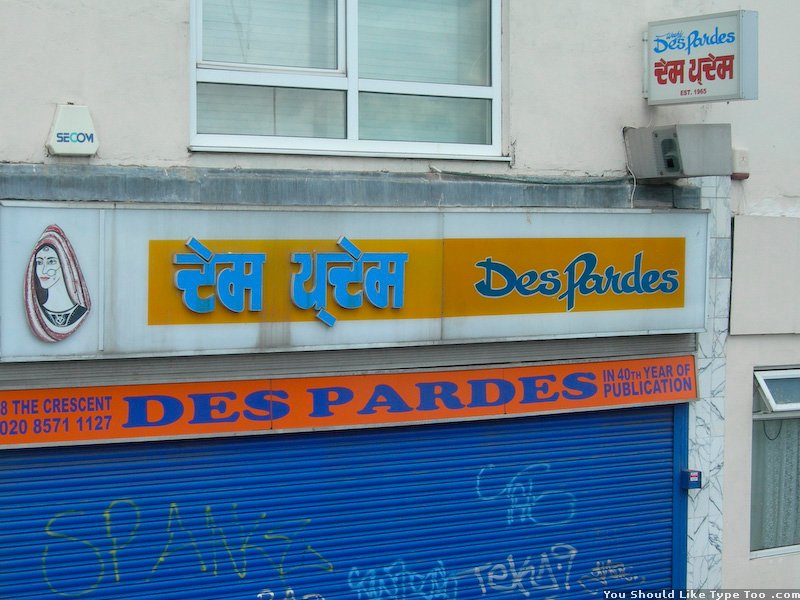


Southall has a large Indian population so I journied there to look for materials for my disertation. Most of the signage is bilingual, in some cases quadlingual. London is full of great signs, these are a few more I enjoyed.
25 Jul – Typeface submission
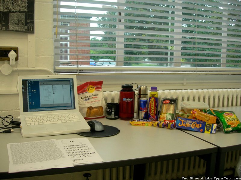

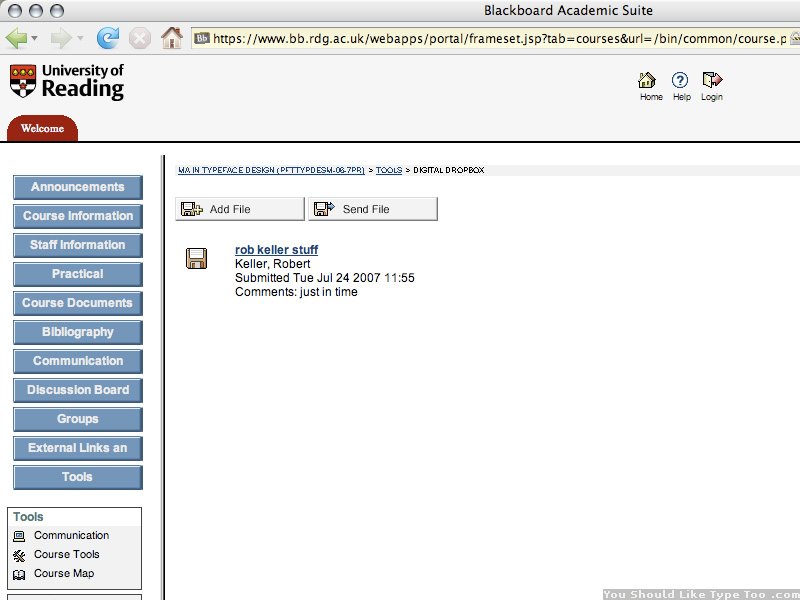
The big day— July 25, 2007. Our last 6 months were spent working on these typefaces, but it always comes down to the last few minutes. The first image shows the necessary rations for the last 30 hours of work (not all was consumed though): jam doughnuts, water, espresso, Red Bull, Lucocade energy drink, Snickers, Starburst, Cheese & onion sandwich, 2 Cadbury eggs, Skittles, microwavable macaroni and cheese, peanut butter and jelly sandwich, Jaffa Cakes, custard creme cookies, and 3 bags of baked salt and vinegar crisps. I am a pig, but hunger is the enemy at 5am, so better safe than sorry. Then there are the screenshots: The first is from VOLT, which I only had one day to try to programme the OpenType features. There are still some more features to add, but most of the essential ones for the Devanagari and Latin actually work. The last image proves I successfully uploaded of my files before the 12:00 deadline.
26 Jul – 24thish Sep – Dissertation research & writing
Nothing was posted during this time as the struggle was solely to come up with an appropriate and interesting and manageable research topic to add some knowledge to in about 3 months. I ultimately landed on researching the typography of newspapers using the Devanagari script. I basically covered the essentials to Devanagari type, how it works, what are the requirements, and then analyzed how three newspapers use type. It was not an amazing research paper by any means, but, I passed :)
25 Sep – Move to Germany
I moved to Bad Homburg to begin working at Linotype on October 1st!
[Update] I ended up working there one year, then I left and moved to Berlin to found Mota Italic in October 2008.