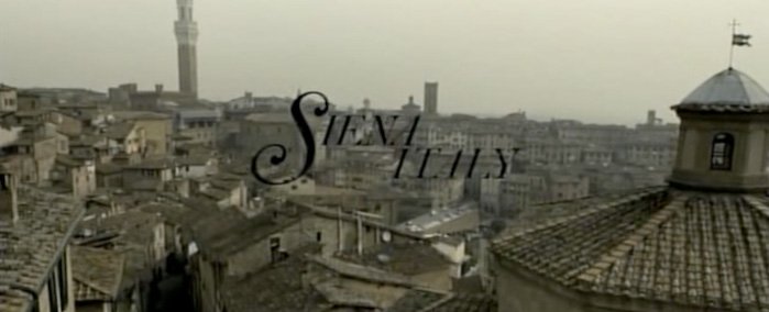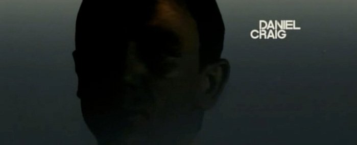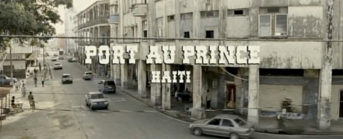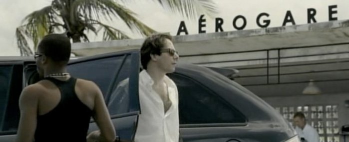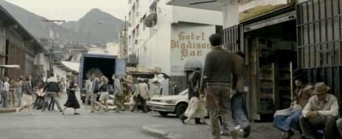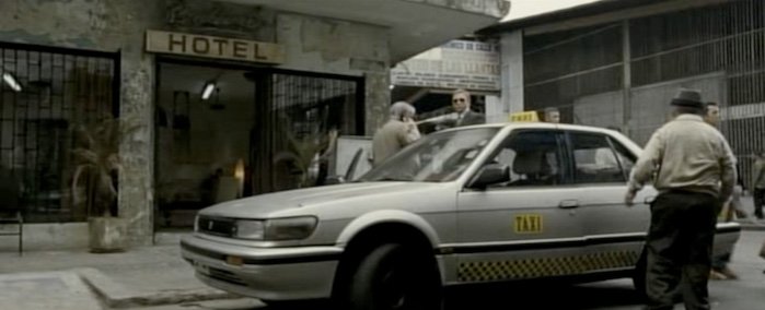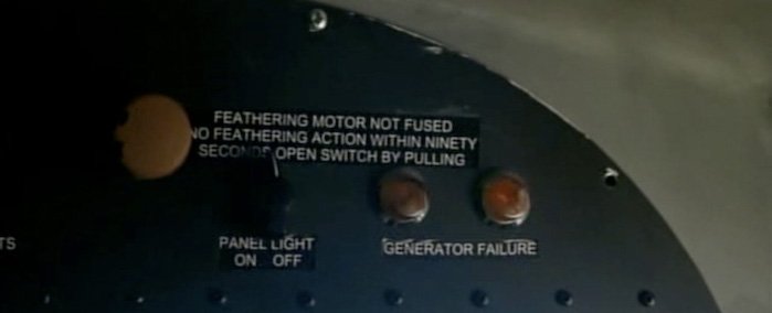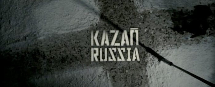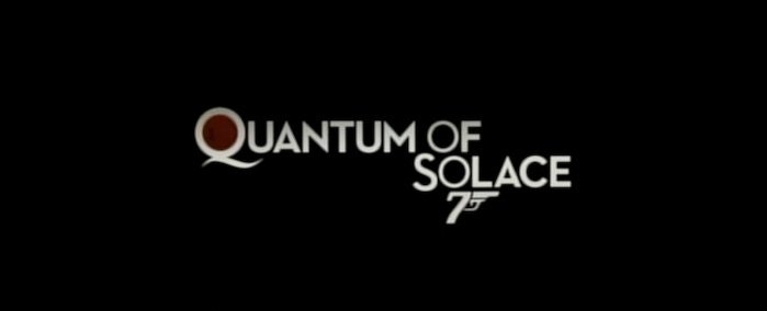
2008’s Bond film, Quantum of Solace, has a number of distinctive typographic treats. Yves Peters has already posted twice on this topic, over at FontShop’s FontFeed and fontshop.be. He has detailed some interesting stories about MK12, Tomato, and the creation of the title sequence and location cards.
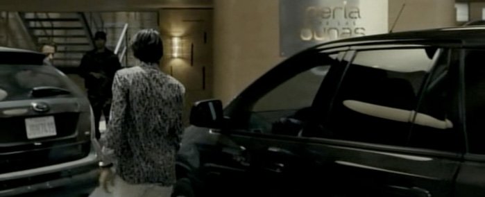
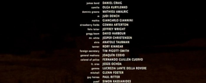
Rather than repost the same articles, this is simply a chronological series of images from the film showing the many specimens of type. The location cards and intro are obvious interesting examples, but when collecting those various images, many more typefaces popped up throughout the film.
