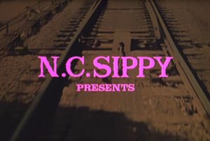
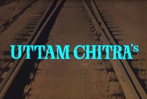
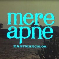
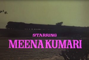
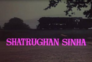
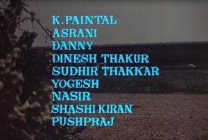
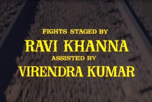
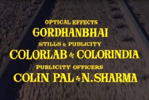
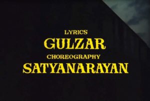
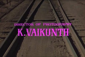
Watching the 1971 Hindi film Mere Apne, I was struck by the lettering of the title credits. It’s all hand done, in simple serif letters with deliberately bumpy contours. The typographic choices are interesting, even if a bit unclear… Letters are set in all caps, except for the main film title which is lowercase. The title ‘mere apne’ is also written in Devanagari and Urdu, and even though the film is entirely in Hindi, the rest of the credits are in Latin with job titles in English. This is a pretty standard practice from what I’ve seen so far, but it’s still strange. I wonder how much of the original audience would have understood.
For sake of completeness, I have screen caps of all the opening title cards. This shows the progressions, color choices, and layout variations.
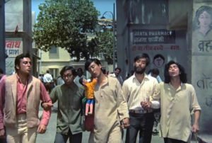
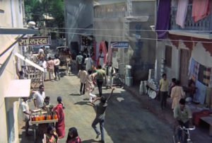
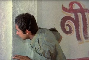
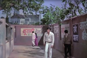
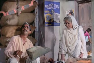
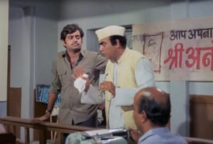
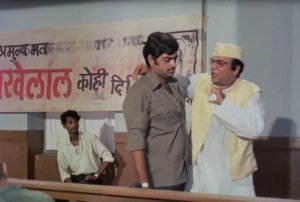
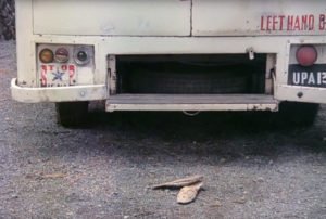
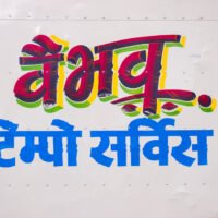
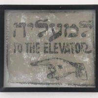
The bulk of the film is set in a small town that repeatedly offers glimpses of posters and painted signs. These aren’t specifically highlighted, but they add some realism to the sets and some eye candy for font nerds. A few are shown here.
We rented this film on YouTube (thanks to it having subtitles), and strangely, there were no end credits – it wraps up with the black screen shown here. I’ve looked for other copies of the film online but none have end credits either… I’ll need to investigate more to see if they did anything unique with the final credits.
