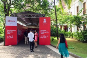
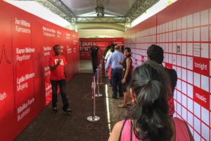
About two weeks later and I’m about over the hangover from my first Kyoorius Design Yatra (KDY). For those of you unfamiliar, this was the 10th year of India’s foremost graphic design/advertising conference. India of course also has the more type-centric Typography Day, but quite frankly, that event is in a different class.
KDY took place over three days, of which I attended the second two. The initial day was a semi-separate event called “Digiyatra”, honestly I’m not so sure what that exactly entailed. I personally found two days to be enough; there’s only so much presentations, inspirations, socializing, and drinking I can absorb.
The main conference was surprisingly good. I’ve been to many design conferences, and I’ve lived in India for about a year, (and atteneded four Typo Days) so I had certain assumptions and biases going into the event. I’m happy to say that KDY exceeded all my expectations. That’s not to say it was perfect, but it was absolutely well done and worth attending.
Rather than write a long, descriptive account of everything, I’ll share my most enduring thoughts on the best aspects and what I think could be improved on.
The Best Parts:
• The venue was amazing: it was held at the Grand Hyatt, one of Goa’s most luxurious hotels ★★★★★ And Goa is always a fun place to visit!
• The entire event was very professionally organized. This included efficient check-in, handy programs, reliable sound and video, and truly important: good time management and sticking to the schedule.
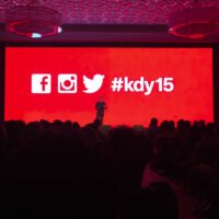
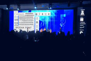
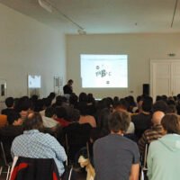
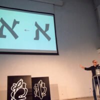
• The video screen was incredible, I’ve never seen a display like this at a conference. Rather than using projectors like usual, this stage had a massive LED display – like something you’d see at a concert. It featured an insane widescreen format, about a 1:2 ratio, and was probably roughly 15’ high by 40’ wide. The whole time I was fantasizing about getting up there and showing giant type samples! However, being LED, the resolution was pretty coarse. This caused some bad rendering for some slides and the colors or contrast were not always optimal. But there have to be tradeoffs sometimes…
• The quality of talks was well above average. I walked away from the event recalling that most talks were really good. But then when I retroactively rated each talk, I did find that they weren’t all equal, but still, the majority were either good or very good (OK is still decent by my standards).
★★★ (Very Good) — 6 talks
★★ (Good) — 4 talks
★ (OK) — 4 talks
∅ (Bad) — 3 talks
Also of note, most talks were about 40 minutes, and there were six that were shorter, about 15-20 minutes. The three presentations I actually ranked ∅ were of the shorter length.
Unfortunately Jessica Walsh gave the same talk as at Typo Berlin 2013 and Neville Brody showed mostly the same content from previous conferences. This was simply too bad for those that regularly attend conferences, but not much problem for the majority in attendance.
• Every evening following the talks were FREE snacks and drinks (beer, vodka, whisky) for 3-4 hours! Each night was like a typical conference’s after party. But then the actual party on the final day was insane. It was scheduled to go till 3am, but I’m getting old and only lasted till 1:30 or 2:00 am.
• The pricing model for the conference is very fair. I paid the full professional rate at the last minute and it was ₹17,000 / ~$250 / ~€225. They have student rates as usual, but best of all, they also offer a “Young Blood” category for professionals under 28yrs old. This is extremely generous because many recent grads may still be struggling with freelancing or taking low paying jobs or internships – so it’s great that this helps more to be able to attend.
• I’d also like to say thank you to the organizers who generously included our latest Mota Italic type specimen in the conference goodie bags. We are grateful for that opportunity to get to reach out to so many people.
Critical Feedback:
• It may seem silly, but my #1 complaint is that there were no name badges. Attendees simply received buttons indicating student, professional, and some 3rd category (maybe young blood?). I can’t imagine any reason why they neglected to make badges other than simply out of laziness. Money should not have been an issue and there was shortage of labor to manually assemble everything.
Conference badges are extremely useful for not only identifying peoples’ roles (attendee, helper, speaker, etc. + designer, developer, manager, etc.) but they also aid in learning new names. I for one need to see/hear someone’s name several times before it sinks into memory, so badges are a huge help. No one wants to have to ask someone’s name every time they meet. Badges are also useful to casually put names to faces, especially at such a large conference like KDY where it’s impossible to meet and speak with everyone.
I made the following tweet during the conference, and then got this reply from the organizer:
I’ve been to A LOT of design conferences, & #kdy15 is only the 2nd one w/out name badges. I can’t understand this terrible UX decision.
— Rob Keller (@rnkeller) September 11, 2015
Hey @rnkeller Have a conversation. Say hello. Meet people who look interesting not whose names are. Let’s meet today https://t.co/jgu06O2mLP
— Rajesh Kejriwal (@rajeshkejriwal) September 12, 2015
Please just make badges next year. It’s not that hard, and it certainly does not hurt or deter conversations – to just “meet people that look interesting” misses the point, but even so, with badges you can still meet interesting looking people.
Some good badge inspiration from David Jonathan Ross on how he made the unique badges for the Typographics conference (he even shared the code to generate them). Or create them in some other way, but please just make them, and make the type large and legible.
• Seating was extremely hard to come by – especially if you were with more than 1 or 2 other people. Attendees had the terrible habit of claiming seats by leaving their stuff on them between sessions. I hope that in the future the organizers will simply announce that saving seats is forbidden. This is an easy and free improvement that almost everyone would appreciate.
• The coffee was pretty bad, but even so, there was never enough of it. Coffee should always be available. However, the sugar cookies were extremely tasty!
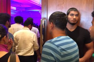
• This was not exactly a problem, but it was weird that there were numerous muscled security guards everywhere – they felt extremely out of place for a professional design conference. Maybe they were supplied/required by the hotel?
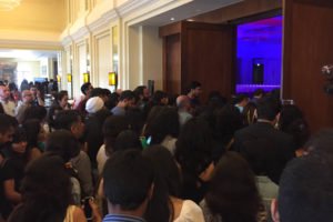
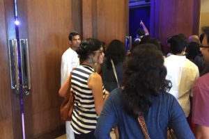
• Finally, the traffic flow for getting in and out of the main hall was terrible.
1) The room was massive with many doors, yet there were only a couple doors open (they actually had all other doors bike-locked shut). This created huge bottlenecks to get in an out of the room, and this shouldn’t have been necessary. I timed myself once and it took over 5 minutes to get out of the room. Each time I was trying to leave I had the thought ‘I hope there’s no fire’.
2) The conference was so packed that everyone barely fit in the room. Too many chairs were forced into the space, leaving room for only one center isle, and one cross isle that went only 1/2 way through the room. Each row was so tight one could barely get past people sitting, but then there was no other way around them.
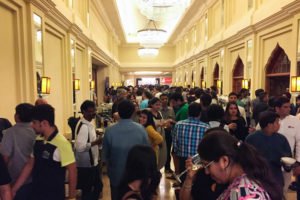
3) Not a huge problem, but it would have been nice if the main passage directly outside the hall would not have been used for lunch and coffee. This made the already busy area more crowded.
There were some 1400–1500 attendees, so space was bound to be limited, but there should be better solutions to most of these space problems. Or else, maybe the number of attendees should be reconsidered. I understand the desire to have as many guests as possible, but there are only so many that can fit into any given space and have a comfortable experience.
In Conclusion
This was a really great event, it was inspiring, fun, and I would highly recommend it to any designer. And although I felt there were several aspects that could have been better, those things didn’t deter too much from the overall experience. I have high hopes for Kyoorius Design Yatra 2016 and am sure it will be even better than this one! See you there again next year!
If you’d like to see more, you can find others’ moments from #KDY15 on Twitter and Instagram.
