Every so often a masterpiece is created that makes its way into the mainstream art world. These pieces […]
Linotype switched buildings in early September 2008. The first row of images shows the old offices from the […]
This show was at Parsons School of Design as a part of the TypeCon conference. This year’s conference theme […]
Linotype has a large underground vault to safely archive, hold, hide, protect, and get out-of-the-way substancial collections of […]
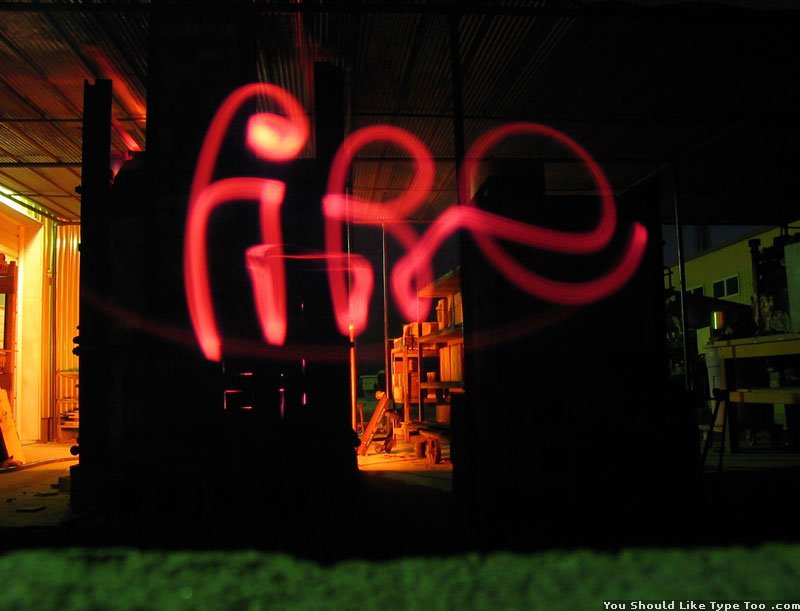
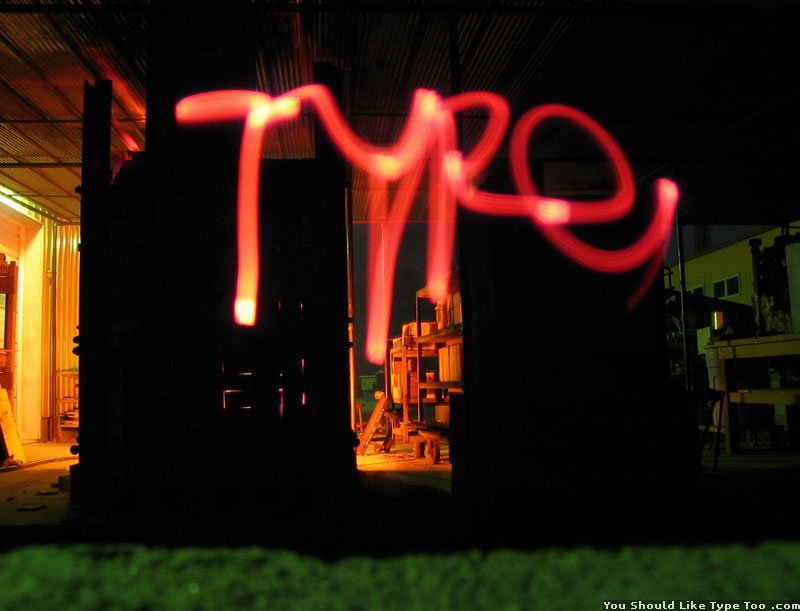
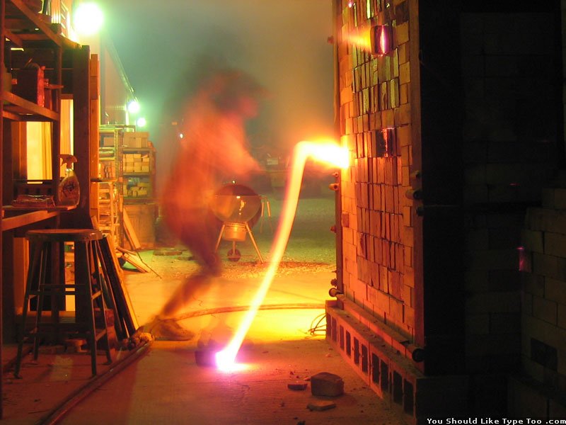
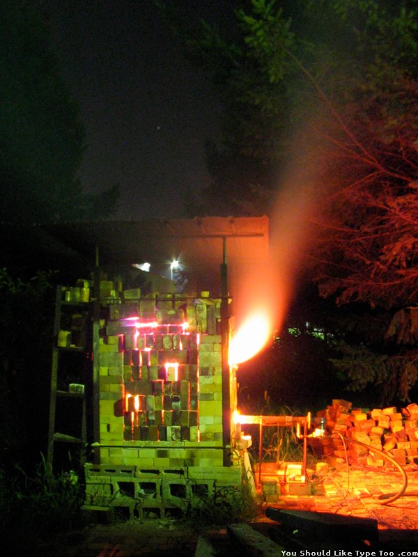
These ceramic sculptures were made in collaboration with artist David Rowe. Vastly different aesthetic and conceptual statements come […]
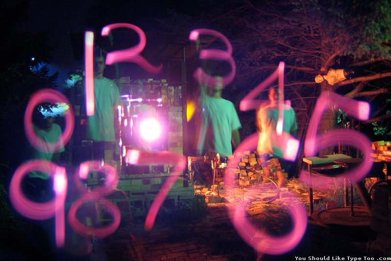
These ceramic sculptures were created for TypeCon 05 with the theme “Alphabet City.”
This is a series of ‘O’s which explores various surface treatments and display methods. The letter ‘O’ often […]
These ceramic pieces are generally straight forward letters. The project began with two-dimensional letters produced on a computer […]
Located in lower Manhattan this cemetery is rather old by American standards with most dates in mid 18th C. – mid 19th C.
These “mini-posters” were made in 2007 for the ICTVC conference in Thessaloniki. This set of 7 different designs […]