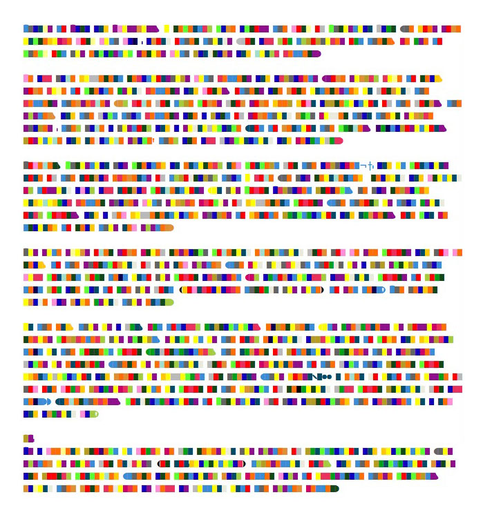
Thanks to Sara and Swissmiss, I recently came across the work of Christian Faur. He does some incredible work with wax (among other things). For all you typophiles out there, be sure to check out his encaustic series with pangrams and vinyl letters.
We all have different relationships with letters and alphabets. Some simply like to read, some like to create using letters and words, others are more interested in forming the letters themselves. My love for type comes from some deep down appreciation of the forms, the system, and the fact that letters are a part of something much bigger than their simple shapes; they have a history and a significance. Not to mention the curves, juxtapositions, positive and negative space – they are all fascinating and beautiful.
However, Christian has created an entirely new concept for the alphabet – and it contains none of the normal elements of typography that I love. He has reinvented reading and writing by tossing away all normal conventions. In his “Color Alphabet” project, he has replaced individual letter shapes with simple blocks of different colors. The theory is that using only colors, and a few differentiated shapes to denote punctuation and numbers, one can be trained to read this new system.
His site skims over some brief research covering everything from how we see colors and how we read, to the shortcoming of his new system. The big highlight though is a php script that will convert your text into his color alphabet. By automatically assigning colors to your text you can to use his font (downloadable through his site) to set text! The header image was made using this entry – including some errors with the auto translation.
In the end, this is a fun, but totally unpractical, experiment. Its usefulness relies completely upon his script, since it is the only existing application to code and display text in the correct color. Unfortunately, the number of potential hurdles this alphabet faces is enormous. There is everything from color blindness to the fact that proper color identification and memory is difficult for humans. This doesn’t even go into the issue of how one would plausibly write in color or the impact of requiring full color printing for all text… Nevertheless, congratulations to Christian who has approached the alphabet in a new and amusing way!
PS–
As a weekend project it would be fun to redesign his system of punctuation and diacritics. His system is built for English only (or for typesetting without accents), and the punctuation marks are poorly conceived. There are certainly numerous other ways to illustrate these marks, making them both more legible while also more smoothly integrating them into the system.


