From July 2008

I receive many questions about how Vesper is developing and when it will be completed. Over the last year work on it has been slow but steady. Now I am happy to report that Vesper is again being given serious attention and progress is accelerating, so the release is approaching.
About Vesper
Vesper is the typeface I began during my year at the University of Reading in the MA Typeface Design Program. It is a text typeface that is clear and comfortable to read; a design suitable for setting large amounts of text such as in books and newspapers. It is not an “invisible” text typeface, but its style is not overly distracting to the reader. When used at larger sizes the unique details are revealed and are easier to appreciate. There are elements such as subtle angles along the inside curves which were derived from experiments in Devanagari calligraphy. The serifs and corners are all slighlty rounded making the printed appearance just every so slightly softer and less harsh than many contemporary, digital fonts.
Also in the family, there is a matching Devanagari design. Stylistically, the Latin and Devanagari influenced each other—therefore they have a closely matching appearance, but neither appears to have forced its style on the other. Developing these together allowed for better harmonization and more creative design decisions.
July 2007 – July 2008
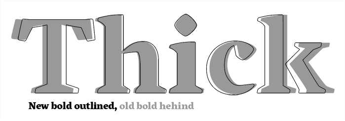
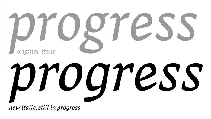
The same day as submitting my dissertation I moved to Germany and then began working at Linotype the following morning. The next few months were spent recovering from the stressful Reading year and getting acclimated to both Germany and the new job. Last December, when I came back to working on Vesper, I began by redrawing the bold and italics from scratch. They are still similar to original versions, but are more refined and significantly better quality.


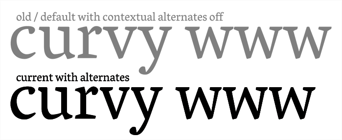
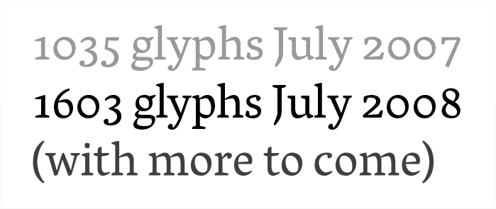
The regular weight has not changed greatly. Some serifs have been altered and the spacing is continually being fine tuned. There are several new additions to the character set to increase linguistic support and to help improve the text appearance. Some of the additions include a Cap ß (also in small caps), many more Unicode specified diphthongs (DZcaron, LJ, NJ, DZ – in all case variants), the full set of diacritical characters for transliteration of Hindi and Sanskrit to the Latin script, and then there are the loads of contextually substituted alternates.

These alternate characters do not change the text markedly – consciously. Rather, they are meant to be subtle or even unnoticed. It is impossible, and undesirable, to completely remove all syncopated texture from the text; but with these alternates, some of the unsightly gaps can be reduced and unfortunate glyph collisions can be fixed. These new characters help by changing widths, serifs become shortened or enlarged, and the various glyph appendages (ears, arms, legs…) shift a bit all to help everything fit together more cleanly. The slight changes in individual letters help create more even word shapes; in turn, these improve the sentences and paragraphs and transform them into beautiful blocks of text.
The Devanagari has been changing steadily. Shapes and spacings have been revised and the character set has grown remarkably. There are now many more conjuncts as well as alternate glyph forms for the Marathi and Nepali languages. These conjuncts are basically ligatures for when two or more consonants are combined together. (One important note though, conjuncts differ from Latin ligatures because they are not optional, they are essential properly setting words). They can vary from being quite interesting, complex, and completely unrelated to the original characters, to others that are more simple and basically a full character and a half form sitting side by side (with some kerning). However, there are still some applications that do not support kerning. So for those cases, there are these additional simple conjuncts are there to help produce more attractive words. And not content to leave things in their default state, many of these simple side-by-side conjuncts have been modified to create smooth transitions and connections and to optically balance weights and ink traps.

1) illustrates how to combine Ka+Ssa to make the conjunct KSsa.
2) to make the conjunct KSsYa – use the half form of KSsa kerned with the Ya.
3) the refined, custom conjunct form of KSsYa showing a better connection.

In this example you will also notice the matras have been lowered to allow tighter line spacing. Another major change, but not as obvious here, is how the headline has been thinned down a few units. In longer texts this helps lighten up the Devanagari a bit more, bringing it closer in color to the Latin.
There will of course also be a bold version for the Devanagari for the final release. Italic Devanagari could be extremely interesting, but will not immediately be developed without specific customer requests.
Keep checking back for more updates…
[Partial] Encoding
(this screenshot is already outdated—there are a few dozen more glyphs now)


[Update] Vesper 1.0 is complete and available for sale exclusively at Mota Italic.