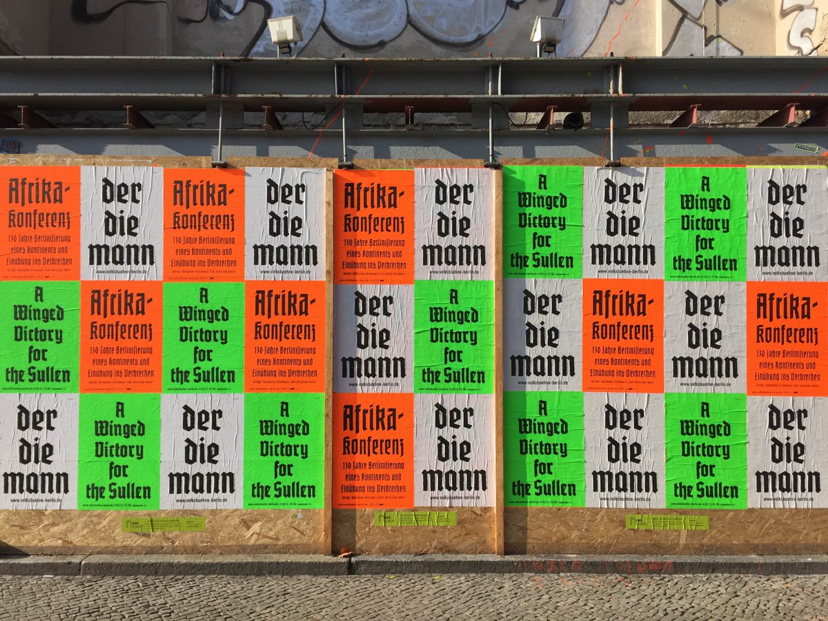
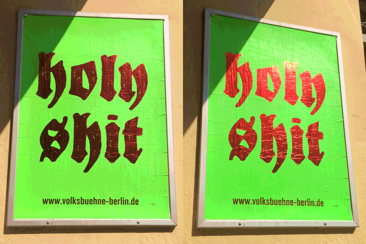
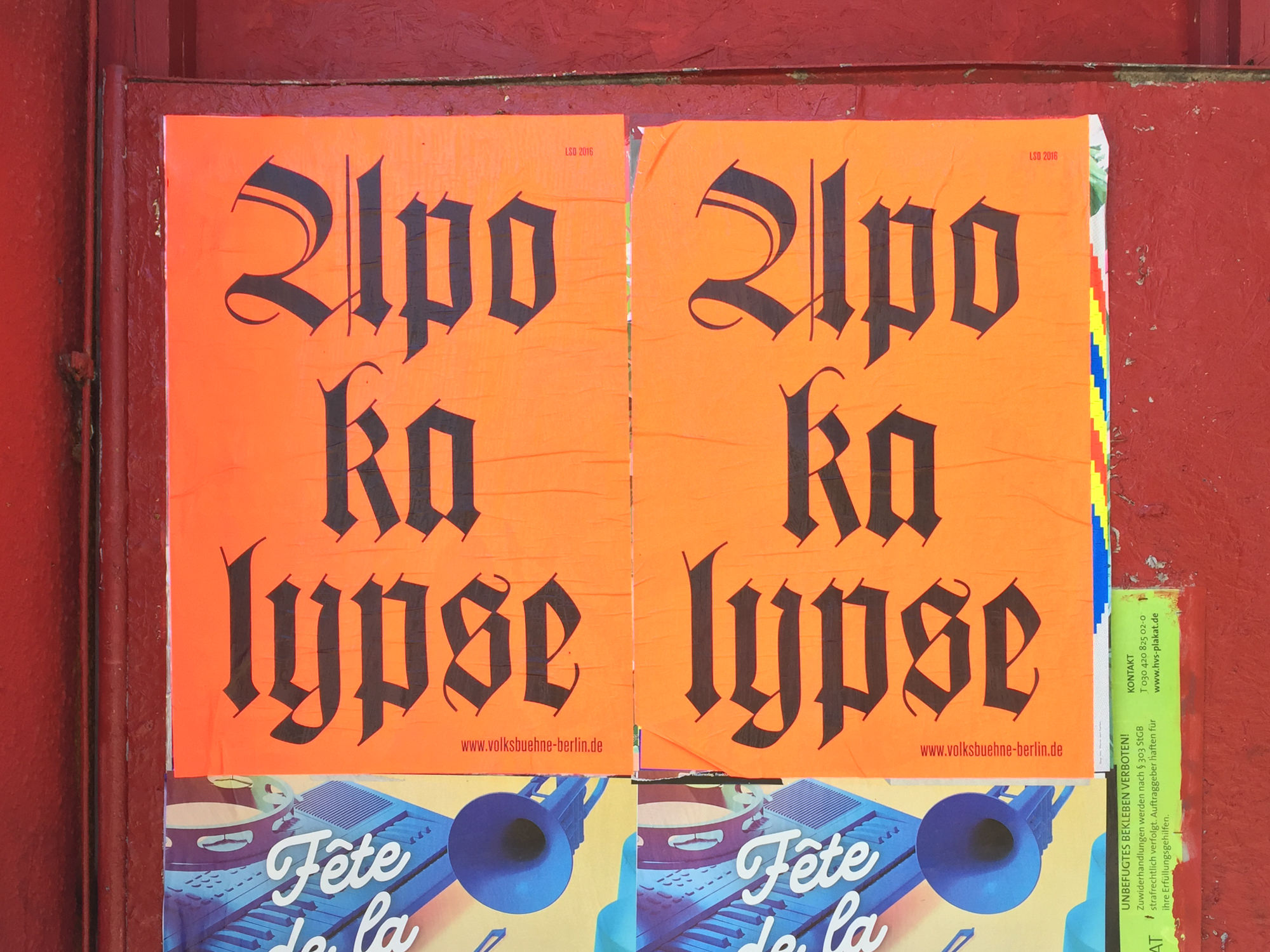
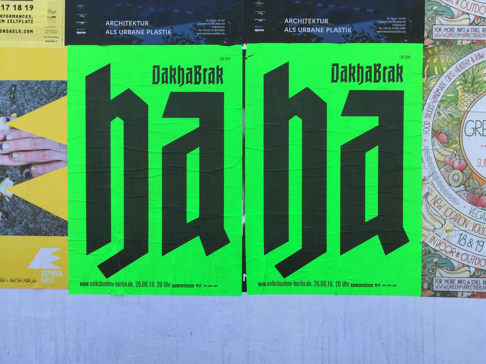
Going through my virtual piles of photos, I’ve came across a few posters that I’ve been wanting to post for some time. Made for the Berlin theater “Volksbühne“, this wonderful campaign has been going on for a couple years now, but never gets old.
Florian Hardwig has already written two extensive pieces (the first, and second) on this series some time ago, and they are very much worth checking out!
These posters stand out starkly against most of the other designs pasted all over the city. The layouts are deceptively simple, but the variety of typefaces and colors keep them looking fresh, eye-catching, and instantly recognizable every time. I’d consider this an incredibly “successful” redesign and advertising strategy… but I am deeply interested to know how this has affected ticket sales, website traffic, funding, etc. I hope the Volksbühne would call these a success as well.


